Angie’s List has rebranded. What’s it all about? What does renaming and rebranding mean for a company like Angie’s List, and will it help them or hurt them? Is it a good new effort? Why did they do it? What’s Hypno’s take on the new brand? Read more and find out!

Before it was Angi, it was Angie’s List.
Angie’s List was an online resource for homeowners looking to add value to their homes through repairs and renovations has recently changed its name and its branding, and has launched a huge rebranding campaign to match. Angie’s List was a leading online home improvement contractor database founded in 1995 by Angie Hicks, and was first set up to serve as a reviews listing website for the services homeowners most often need – repairs, plumbing, roofing, carpentry, as well as additions, remodeling baths and kitchens, and a myriad of other services. Angie’s List has evolved over the past 27 years, and has grown to be a full service, member supported resource for consumers looking to find the contractor that can help them with their project. The site also contains listings of remodeling contractors as well as information about services and helpful articles and tips.
Now under it’s new name, Angi is a suite of apps and lead generation tools designed to give businesses access to potential customers. The lead generation aspect of it is what the public doesn’t fully understand or see sometimes. When a homeowner goes to their new shortened URL Angi.com, and starts looking for a roofer or plumber they enter their contact data, and answer a few questions, to then get matched up to contractors in their area who are actually paying members that are buying the leads, in real time from Angi. They can then get in touch with the consumer to provide their quotes and eventually turn it into a paying job. This model is smart because it gives a first-mover like Angi a growing strength and popularity to attract homeowners (the money) who enter their data for free, and the company can then sell that data in the form of leads for members, at a great profit. The rating system keeps vendors on their toes, and helps the good ones rise to the top in terms of successful jobs completed, while weeding out the bad ones over time. Thus creating value for consumers. It’s a model that took 20 years to turn profitable with Angie’s List announcing a first profit only in 2015.
Some Startups Fail Miserably
We know a story of a startup who thought they were going to beat Angie’s List at their own game, but the owner had a flawed business model and very naive perspective; they eventually failed miserably. Their idea was to collect data from homeowners face to face in real time, one at a time (a very time consuming labor process) at their homes. Angie’s List, now Angi, deals in massive volumes of consumer data. And the genius of their business model is that people willingly come to them and drop all of that data off freely, of their own will, at any hour of the day or night, providing additional clues so Angi can match them with an appropriate contractor or service provider. The founders of Angi understand the tricky nature of consumer trust. They understood that by offering a great value to their consumers, to be able to read real reviews and ratings could help grow trust. They grew trust in their brand to a higher level. And now much of it is automated. Angi employs over 4500 people now, and with their acquisitions, and automation of activities on their websites, have strengthened their position well into the future.
Short and Easy Does It
So what’s with the new name and rebranding? Well you can see it’s an evolutionary thing and a shortening of the name similar to Coca-Cola becoming Coke, Dunkin Donuts becoming Dunkin’s, Apple Computer becoming Apple, and Kentucky Fried Chicken just becoming KFC. The shortening of the name allows the company to do and be other things besides a “list” too. The name was changed according to the CEO Oisin Hanrahan because “At its core, we’re not a list,” and the name was confusing to homeowners. The shortened name also allows for people to connect with the name and emotionally connect with the brand, in that it is more humanized now. Hanrahan said they went with Angi, instead of Angie, because it was a unique name – and thus created an individual brand that could be unique for their company. The new branding will be on the website, and the app moving forward, and TV Ads have been produced that are airing on all the fixer-upper and home renovation channels.
The website URL has also changed to angi.com, which is much easier to remember and type, and since there’s no apostrophe in the name anymore, that also solves a small problem of someone using the punctuation in the URL accidentally.
Looks New and Different
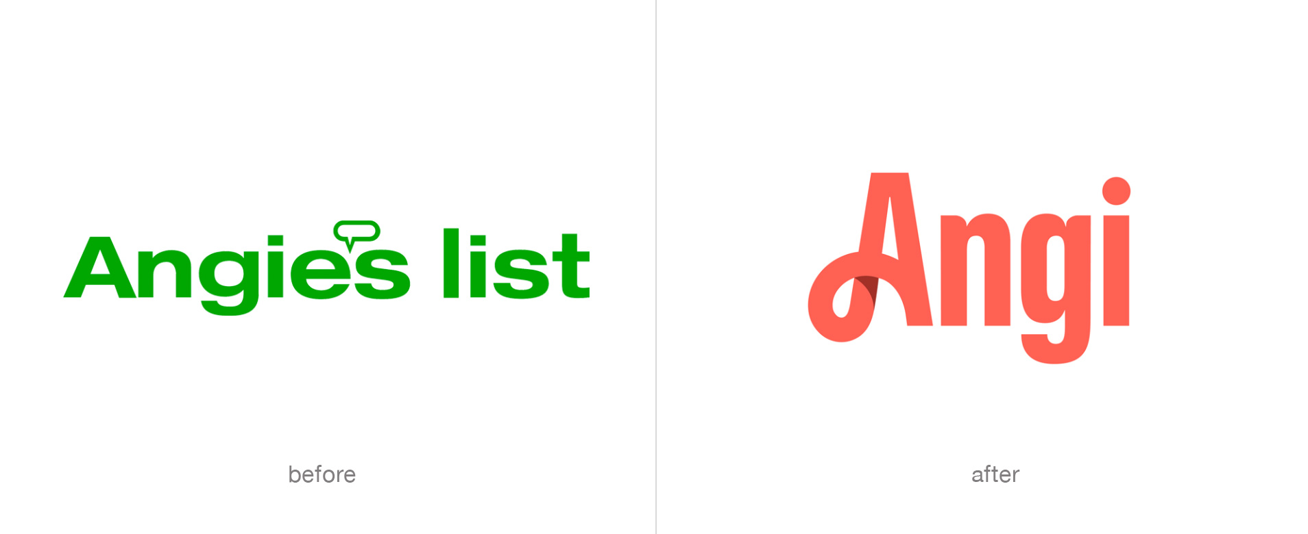
The new brand was announced and launched in early 2021, and from a visual continuity perspective, it’s a big leap from the old Angie’s List logo which had multiple speech bubbles, and was mostly green, to the new coral red Angi logo that has a dramatic swoosh for its capital A, and feels more feminine. But it’s not a bad leap from the sound of the name of the company from Angie’s List to just Angi. It makes sense to remove the “list.” The spelling, leaving out the letter E, gives the new name a unique feeling of modernity, and an air of digital era branding savvy. It also made it easier for them to procure the domain, though that probably still cost them a small fortune because any four letter domain is going to be super expensive.

Names like Fiverr, Canva, and even Etsy and Yahoo are memorable short unique names that help create strong unique brands for those companies, and Angi follows in their footsteps for creating a similarly short and memorable, and modern brand name. The new logo looks “new” and is definitely different. That’s a very good thing for a brand!
For their new logo, they chose to create a highly stylized logotype (a type-only logo with no other “mark”) that is unique both in the type-form and in the color. It is very custom, and compared to their old logo, it is very “fresh.” There is one small 3d shadow effect of the lower looping embellishment on the letter A. In a world of flat logos, this makes a little departure, that’s visually interesting. The lower case letters N and G have a roundness that softens them to match the swoop curves, and the last letter I is just simple with the dot on the top floating nicely to balance out the left side of the logo. Overall, you might say that the logo has a more feminine look to it, and that’s no surprise considering that it’s mostly women who drive home remodeling and home improvement considerations and decisions.
To not lose people on their website who may think they’ve ended up in the wrong place they currently are using some brand-bridging mark near the logo to explain to people that the company name and brand has changed. Notice how the old logo is there to explain the change. They’ll probably keep this going for about one year more. Clunky but necessary, and effective we’re sure.

As one of the most successful companies in this consumer space, with over $77 million in net income (2018) Angi is positioning itself to continue to be a leader in consumer data sales and management. By rebranding to Angi, they’ve expanded the types of things they can add in the future as well, where the list will no longer be applicable. They also own other (similar) companies like HomeAdvisor and Handy, and the new name helps them integrate those companies in the future as well.
For all the benefits of the new simplicity of the new logo and the new name, we can’t help but feel that there’s a bit of a loss in the transition, where before you could look at the logo and understand something about the nature of the business: the speech bubbles implied some form of conversation, quotations or reviews, and the name implied that there would be “many” of what you might need to read in there being a “list.” There’s nothing in the new logo to tell you what you will reach when you go to Angi.com so they will now be relying solely on their rebranding efforts and dollars to help people associate the new brand with their services and offering.
What Would Hypno Do?
Overall we’re a fan of the new brand and the reasoning behind it. And perhaps the new simplification is all for the best in the end, and it will come to be a strong symbol for them over time. But one small change might have helped them create just a little bit more continuity and brand recognition for their customers (both consumers and contractors). And also could have helped with a reinforcement of being able to “read” into the logo a bit more. There are always going to be critics of any brand being changed, especially a beloved brand like Angie’s List. Knowing that a rebranding goes through numerous iterations and changes on the drawing board, in the design studio, we’d love to see the steps and iterations that the designer for the new Angi logo went through to arrive at their final result. We understand and respect the need to eliminate the unnecessary and whittle something down to its essence. We are big fans of creating clarity and simplicity. Perhaps this one we offer as an option below was in their final mix, but got crossed off for still being too literal, and for still being too limiting. We would have argued for it as a good evolution for the brand, that helps bridge the gap between the past and the future. But what do you think? Let us know!

What Our Clients Say
 Verified Google Ratings from our clients on Google, give you confidence that you’re dealing with the real deal. Hypno Design’s Google Rating is 5.0 stars, which is the highest ratings Google offers for reviewers to award to businesses.
We invite you to read what they have to say about their experience working with us. Some of these reviews are from people whom we have been working with for over 20 years. Helping them with all kinds of marketing services and unique creative logo and branding projects.
Read More


