Please note:
All of these thumbnail images below link to static examples for “look and feel” review. Click on them to view larger. The home pages are all intended to have motion graphics, or video backgrounds, but you will only see static images. For this reason, each design is presented with 4 different background images on the homepage – to simulate the changing imagery.
Because these are static images, there is no functionality on the example pages that these link to for review. You cannot click on buttons, or interact with content, but you can scroll your browser. Also – the simulation of fullwidth design is not fully reflective of the real final programming for the website. For instance the areas of text in the body of these designs will appear larger than they really would appear in the final website. This may cause some blurring depending on what size your browser is that you are viewing these static images.
MFS Website Design Option 1
PLEASE CLICK ON THUMBNAILS TO OPEN FULL PAGE STATIC REVIEW LINK
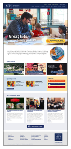
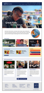
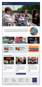
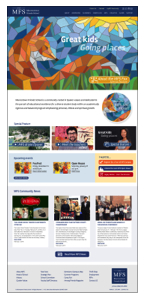
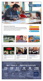
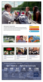
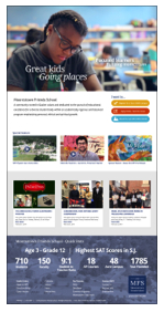
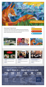
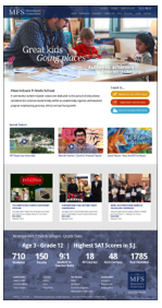
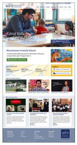
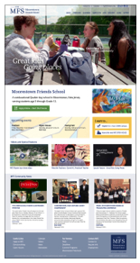
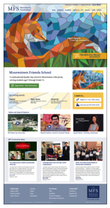
Notes: The first 4 thumbnails below show the home page, and the changing video content that is on it.
In this design the site is given a fullwidth design with a large fullwidth video background at the top with animation. In the animation the words and graphics appear and the text floats and appears over the background video. The Top Navigation also features the new white logo for horizontal use. There is an alternate coloring option in this set as well. After viewing an example design, click your browser’s back button to return to this page, so you can click on another example to view.

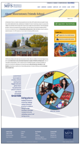
mobile

secondary page level
 alternate colors
MFS Website Design Option 2
PLEASE CLICK ON THUMBNAILS TO OPEN FULL PAGE STATIC REVIEW LINK
Notes: The first 4 thumbnails below show the home page, and the changing video or photo-slide content that is on it.
In this design the site is given a fullwidth design with a large fullwidth video background at the top with animation. In the animation the words and graphics appear and the text floats and appears over the background video. The Top Navigation is completely hidden until the user scrolls on desktop and laptop computers. There is a simulation of this included in this set – though it does not mimic this behavior exactly. This is the only design example that has the navigation staying at the top of the page. The top navigation also features the new white on blue logo for horizontal use. After viewing an example design, click your browser’s back button to return to this page, so you can click on another example to view.

mobile
this shows what happens when you scroll – the top navigation slides down and has transparency.

secondary page level – always has top navigation present

simulation of scrolling action – navigation appears and animates down
THE HIDDEN NAV at top of page – Once the user scrolls on this page, the Navigation appears at the top, and it stays in place. It calls attention to itself as it fades in and does not move from the top. The other pages on the site would not have a hidden Nav like this. It is special for the homepage. These are a few sites that demonstrate how a hidden Nav at top of page works:
http://www.su-casa.co.uk/
http://www.probablecauseband.net/
Video demonstrating this: https://www.youtube.com/watch?v=lfScz9nIxyQ
MFS Website Design Option 3
PLEASE CLICK ON THUMBNAILS TO OPEN FULL PAGE STATIC REVIEW LINK
Notes: The first 4 thumbnails below show the home page, and the changing video content that is on it.
In this design the site is given a fullwidth design with a large fullwidth video background at the top with animation. In the animation the words and graphics appear and the text floats and appears over the background video. The Top Navigation is white and semi-transparent, on the homepage, and also features the new blue logo on white for horizontal use. it is a solid white background on the rest of the website and does not overlap any images or video except on the homepage. After viewing an example design, click your browser’s back button to return to this page, so you can click on another example to view.


mobile
secondary page level